
In the printing industry, it’s pretty much an accepted standard that an effective resolution of 300 dpi is high-resolution. (See a previous article for the difference between actual resolution vs. effective resolution.) Which means that when ink is put to paper, you will get a high-quality reproduction of your image. So no matter what, as long as your effective resolution is 300 dpi, everything in your Photoshop file will look great!
Okay, that’s not true.
While a picture may be worth a thousand words, if you’ve gone to the trouble to put actual words in your file, you probably want them to look as good and communicate as well as the photo. So let’s talk about the resolution of a Photoshop file that contains text.
As you know, Photoshop is not the ideal program for creating large amounts of text. However, sometimes it’s necessary to create headlines with special effects or to include a little bit of text in an ad. When this happens, keep in mind that text needs some special consideration if you want it to look good once it’s printed.
In programs such as InDesign, Illustrator, and Quark, text is vector- based. That means it has clean lines and sharp edges and if you enlarge it, you don’t lose any quality. When text is set in Photoshop it becomes rasterized. In other words, it’s turned into pixels. While pixels are fine for a photo, text that has been turned into many little squares will not necessarily look clean or crisp after it’s printed.
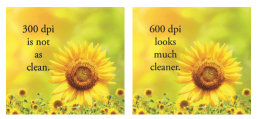
The text in the photos is set in 12 point Adobe Garamond Pro. The photo on the left is 300 dpi. You’ll notice that the image itself looks fine. The text, however, is rough, blurry, and faded looking. The photo on the right is 600 dpi. There isn’t any noticeable difference in the sunflower, but the text is obviously cleaner, blacker, and sharper looking.
If you’re creating text that’s 12 point or under, and your effective resolution is 300 dpi or less, you end up with bitmapped copy that can be unattractive and very hard to read. Which is why it’s important that the resolution of any layered Photoshop file containing text is at least 600 dpi, assuming you’ll be printing it at 100% scale. As you know, once the file is flattened you can’t just punch in a higher resolution to improve things.
The higher the resolution, the more pixels the image contains. The more pixels, the cleaner the image and the better the detail. For text, this translates into crisper, smoother-looking copy.
If you have more questions about using text in Photoshop, please contact us!