OR: Am I going to be howling mad that my file isn’t perfectly perfect for perfect bound?
Let’s be honest: there’s something about a perfect bound publication that says it’s a piece worth hanging onto. The square spine and heavier cover stock suggest that the content is meant to be referenced again and again. A feeling of permanence is implied.
Here are some tips for working with—instead of against—the nature of perfect bound covers to get the absolute most out of your piece.
The bleeds for a perfect bound cover need to be .25 inches rather than the standard .125 inch bleed required for interior pages. We’re not going to get into the boring details of “why;” just be sure to include a full .25 inch bleed for the front cover, inside front cover, inside back cover, and back cover.
The cover can roll a bit toward the front or back as it’s applied. If your front and back covers are blue and you choose to make the spine white, then that little bit of movement can be noticeable on the finished product. (See Figure 1: Not Good). What to do? Don’t make hard color changes along the spine. Try a gradient so that any rolling that occurs isn’t obvious. (See Figure 1: Better). Or flow your background all the way across the spine. (See Figure 1: Best.)
Most of the perfect bound publications we produce have a cover with a hinge score. The cover glues to the first and last interior pages. To ensure that the cover opens easily, the cover is scored 3/16 – 1/4 of an inch away from either side of the spine. Allow for this if you feel it will be distracting to have the score running through cover copy.
You don’t want any copy or critical images to end up inside the glued area, so you’ll want to allow a .5 inch inside margin on the inside covers and the first and last pages to prevent that.
(See Figure 2.)
Some people prefer to build their own perfect bound covers. Your CSR will calculate the spine width based on your paper weight and final page count. If either of these change, you will need to have the spine width re-calculated and then adjust your file. Remember that perfect bound covers must be built to the correct size. Even if we scale your inside pages for the correct final trim, we can’t scale your cover.
Otherwise you can provide the individual cover pages with the necessary bleeds and margins and have us build the cover. This is typically done at no charge.
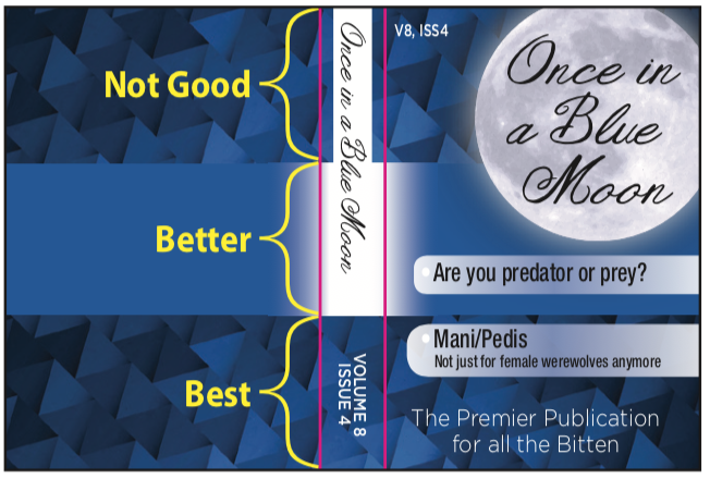
Figure 1. Perfect bound cover: outside. This is one example of color transitions across the spine. The general idea is to avoid hard color changes if you’re concerned about the little bit of rolling that can happen during application. The pink lines represent the hinge score. You may want to avoid positioning text where the scores will run.

Figure 2. Perfect bound cover: inside. The yellow area represents the spine. The pink areas represent the hinges where the cover will glue to the first and last interior pages. The yellow area must be free of ink. Allow a larger margin on the spine side (pink areas) of the inside covers to prevent text from getting glued inside the hinges.
If you have questions about setting up a perfect bound cover, please contact us!
